the goated onboarding guide for hard paywall. $300k MRR app

ill try to keep the yapping to a minimum, cause my attention span is also that of a goldfish. but a few things before i go through each section.
-
haptics should be happening often, it just makes it satisfying to complete. keeps people going.
-
almost always allow people to SKIP any section of the onboarding, especially if it requires more than 2 seconds to answer.
-
follow me for more goated info, any comment and questions
welcome to the QUITTR paywall, the anti gooning app! 300k MRR, one of the best hard paywall onboardings out there! shoutout @alexsllater
clean animation/loading screen, custom made, could be done with claude in the big 2026 though so that is good for you
start quiz button helps increase the sign in percentage due to them commiting before being prompted to sign in.
IF YOU WANT YOUR USERS TO SIGN IN EARLY, DONT MAKE IT THE VERY FIRST PAGE


quick demo as to what you will see in this app, good to have in the beginning of the paywall, and just throughout. keeps users aware of what they are getting into
EASY QUESTIONS TO ANSWER!
If possible reduce text fields, or make them optional.
anything that takes MORE than 10 seconds per page should be ditched unless absolutely necessary.
and if it IS NEEDED, split up the question into more then 1 page.
KEEP THEM ENGAGED
everyone loves a calculating animation, not too long, but enough to seem like it is really calculating.
el clasico, the bar chart, just add one if you can.
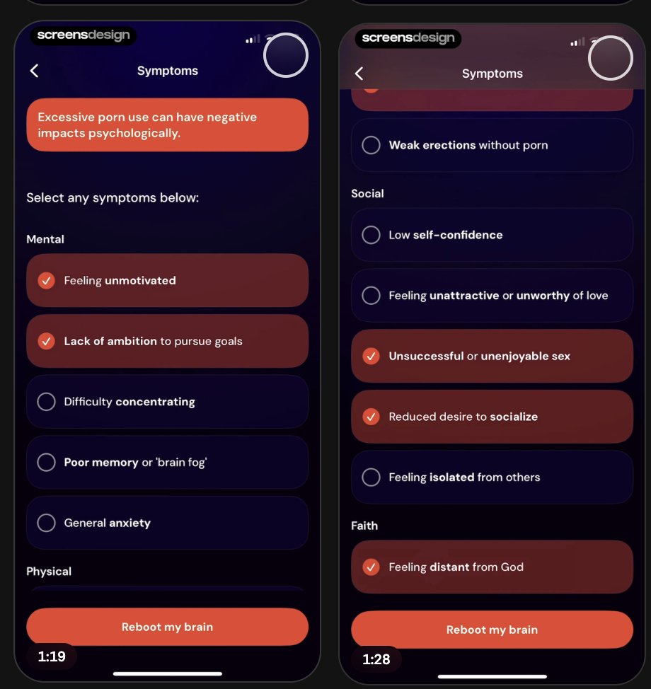
asking the users pain points/struggles, makes them more invested.


NOTICE HOW THERE IS NO TEXT FIELDS, NEVER TEXT FIELDS
make the user feel like what they are trying to solve is REALLY worth solving
RED IS BAD WHICH IS GOOD!
now show the user the path to success!
BLUE IS GOOD! YIPPEE!
some custom graphics, very swag!
social proof is nice, continue to iterate HOW BAD the issue is, AND HOW GOOD it is to solve it!
More social proof.
Reviews are the meta and needed, find a doctor to talk about it, or a professional, or something,


domain authority and the appeal to authority is crucial, ESPECIALLY, for recovery style apps. or education apps
another silly graph, goated
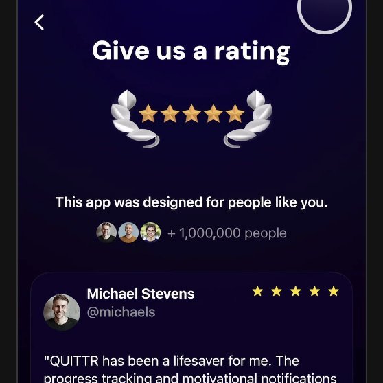
classic rating page
as i said before, try and provide legit value if you can, BEFORE the rating.
people tend to be more accepting of leaving a review on paywall if it feels right, you give them a little treat
I personally dont use this style of stuff, but i have heard pretty good success stories from others.
make the user commit, even a small thing like this.
i assume it is a psychological thing where if you commit physically like this, you will commit your bank account as well.
this is a nice animation, and look!


they display the plan/card thing again. remind the user what they are getting when paying.
long af, information saturated, first paywall page.
helps show authority, trust, and is informative.
i prefer it all fitting in one page, but scrolling clearly works too
CLASSIC one time offer.
yearly is goated, imagine in 365 days, when money magically reappears.
the monthly/weekly comparison is great, sometimes apple rejects. but lowkey they are random about it. just gotta get lucky i guess
if you do a hard paywall, and your app is not ugly af (SHOULDNT BE)
show off the screens in the paywall. it helps for sure.


people get annoyed when they cant see the product before
el clasico PT2. the close the pay screen and show an even cheaper price.
apparently this isnt allowed (i guess apple approves it though, so do at your own risk)
yippee you just paid, colorful screens!
congrats you made it, please follow or else

Related articles

How I'd make $10 million with AI agents
Two markets worth trillions are opening at the same time. I've been through 3 platform shifts living in Silicon Valley building/selling VC-backed companies and I've NEVER seen this.

How to Make a Highly Successful Mobile App ($0 to $3k in 45 days)
The product ain't special, but it's important.

Copy Claude Fable 5’s Thinking Before It’s Gone
You Have a Few Days to Copy Fable 5’s Brain Into a Cheaper Model. Here Is How. July 12 is the last day Claude Fable 5 sits inside your plan for free. After that, it moves to pay-per-use credits, and…