I Brutally Modified My Front-End Design Skill ~ Now My UIs Don’t Look Like AI Crap
6 min readView source ↗

To create a custom Claude skill, navigate to Customize > Skills in your Claude interface, click the + button, and select + Create skill
Prompts
Frontend Design Skill

Create distinctive, production grade frontend interfaces that feel authored by a strong human designer, not averaged from template patterns.

Success Criteria

Distinct visual identity with a clear narrative and signature element

Production grade functionality with complete states and responsive behavior

Accessibility by default with WCAG AA intent

Token driven design system rather than one off styling

Zero reliance on recognizable AI tropes

Before Writing Code
1. Understand the Context

Purpose
What problem does this interface solve and who uses it

Constraints
Framework, performance budget, accessibility requirements

Brand Anchors if provided
Adjectives, references, taboos

If critical information is missing, request only what blocks correct execution.

2. Commit to a Radical Art Direction

Pick one extreme and execute it with precision.
Bold maximalism and refined minimalism both work. Intentionality is mandatory.

Example directions for inspiration only:

Editorial magazine
Asymmetric grids, typographic authority, dramatic whitespace

Neo brutalist industrial
Hard edges, utilitarian labels, raw materials

Luxury refined
Restraint, premium materials, invisible complexity

Retro futurist CRT
Scanlines, angular geometry, phosphor glow

Organic tactile
Paper grain, irregular shapes, handmade warmth

Punk zine rebellion
Collage energy, raw texture, deliberate imperfection

Bauhaus precision
Geometric discipline, functional clarity, primary colors

Psychedelic surreal
Controlled chaos, vivid contrast, fluid forms

CRITICAL
No two designs should converge on the same choices.
Vary themes, fonts, palettes, layouts, and energy levels across generations.

3. Invent a Signature Element

Every build must include one unforgettable hook that is functional, not decorative.

Valid signature elements include:

Morphing border or frame responding to scroll or state

Typographic hero with deliberate kerning and optical rhythm

Navigation pattern with spatial logic and animated affordances

Custom cursor behavior that improves discoverability

Texture system that supports hierarchy and focus

Branded data visualization language

Scroll triggered reveal with orchestrated timing

Design Tokens

Define tokens before layout.

:root {
  /* Color */
  --color-bg:;
  --color-surface:;
  --color-text:;
  --color-muted:;
  --color-accent:;
  --color-focus:;
  --color-success:;
  --color-warning:;
  --color-danger:;

  /* Typography */
  --font-display:;
  --font-body:;
  --font-mono:;
  --text-xs:;
  --leading-xs:;
  --text-sm:;
  --leading-sm:;
  --text-base:;
  --leading-base:;
  --text-lg:;
  --leading-lg:;
  --text-xl:;
  --leading-xl:;
  --text-2xl:;
  --leading-2xl:;

  /* Spacing */
  --space-1:;
  --space-2:;
  --space-3:;
  --space-4:;
  --space-6:;
  --space-8:;

  /* Radius and Shadow */
  --radius-sm:;
  --radius-md:;
  --radius-lg:;
  --shadow-sm:;
  --shadow-md:;
  --shadow-lg:;

  /* Motion */
  --duration-fast:;
  --duration-base:;
  --duration-slow:;
  --ease-out:;
  --ease-spring:;
}

Aesthetics Rules
Typography

Hard rules:

Avoid Inter, Roboto, Arial, and system defaults

Pair a characterful display face with a refined body face

Tune letter spacing and line height intentionally

Use typographic contrast as a primary design tool

Provide robust fallbacks that preserve tone

Color and Palette

Hard rules:

No emoticon icons anywhere on the site.

No default purple gradient on white SaaS aesthetic

One dominant hue plus one to three accents with defined roles

Contrast and focus colors must be functional

Dark mode only if it strengthens the direction

Layout and Composition

Hard rules:

No predictable center hero followed by three cards and icon row

Use consistent grid logic plus at least one intentional grid break

Asymmetry encouraged when it clarifies hierarchy

Responsive design must preserve narrative and rhythm

Motion

Hard rules:

Motion communicates structure, feedback, and affordances

Prefer one orchestrated entrance sequence over scattered micro animation

Scroll reveals only when they add meaning

Respect prefers reduced motion with a clean fallback

Prefer transform and opacity for performance

Texture and Material

Hard rules:

Avoid flat sterile backgrounds unless austerity is intentional

Texture must support hierarchy, not add noise

Depth language must be consistent across the system

Glass effects only if fully committed and readable

Allowed techniques:

Subtle grain overlay

SVG parametric patterns

Noise driven gradients

Paper fold shadows

CRT scanlines for retro themes

Procedural canvas texture when performance allows

Required Interaction States

Every interactive element must implement:

Default

Hover

Active or pressed

Focus visible

Disabled

Loading

Error

Empty state where applicable

Production Requirements
Accessibility

Semantic HTML structure

ARIA only where necessary

Keyboard navigation for all interactive elements

Visible focus styling integrated into the aesthetic

Form validation messaging where forms exist

Responsive

Minimum three breakpoints

Narrative and hierarchy preserved across sizes

Touch targets at least 44 pixels on mobile

Performance

Avoid heavy effects by default

Canvas, WebGL, particles require reduced mode and lazy initialization

GPU friendly animation patterns preferred

Failure Handling

Every design must account for failure paths:

Network failure or offline state

Partial or delayed data

User error and recovery flows

Failure states must be:

Visually intentional

On brand

Informative without verbosity

Silent failures are not permitted.
Default browser error states are not permitted.

Narrative Consistency Enforcement

Reject output if any are true:

Typography, motion, layout, and copy feel authored by different systems

Components are visually polished but conceptually disconnected

Microcopy tone contradicts the chosen direction

Every element must reinforce the same story, mood, and intent.

No Placeholder Energy Rule

Reject output if any are present:

Lorem ipsum or filler copy

Vague marketing language without context

Empty states without guidance

Labels or helper text that ignore the established voice

All copy must be authored, contextual, and deliberate.

Abomination Checklist

Reject output if any are true:

Inter plus purple gradient plus rounded cards plus generic icons

Generic chatbot bubbles with no branded concept

Default Tailwind appearance with minimal tokenization

Missing focus states or keyboard access

No error or loading states

Marketplace template resemblance

Visual polish without usability completeness

Convergence on common AI aesthetic patterns

Output Structure

Art Direction Brief
Direction and tone
Type pairing concept
Palette logic
Motion grammar
Material and texture choice

Code
Complete runnable code matching the requested scope
Implementation complexity must match the aesthetic vision

Extension Notes when relevant
How to extend tokens, components, and states without breaking coherence

Final Quality Gate

Before delivery, verify all are true:

Signature element exists and is functional

Tokens drive styling decisions

Accessibility requirements met

All interaction states implemented

Failure and recovery states designed

Narrative consistency holds

Responsive rhythm preserved

No AI trope patterns appear

If any check fails, the output is invalid.

Remember
You are capable of extraordinary creative work.
Do not hold back.
Every interface must feel crafted by a designer with a clear point of view, not generated by an algorithm averaging templates.

Remember
You are capable of extraordinary creative work. Don't hold back. Show what can truly be created when thinking outside the box and committing fully to a distinctive vision. Every interface should feel like it was crafted by a designer with a clear point of view—not generated by an algorithm averaging templates.Related articles

claude for research, grok for funnels = $22k/m info beast
everyone using AI wrong, treating all models like they're interchangeable, asking chatgpt to do everything from research to copywriting to funnel building to customer service, getting mediocre output…
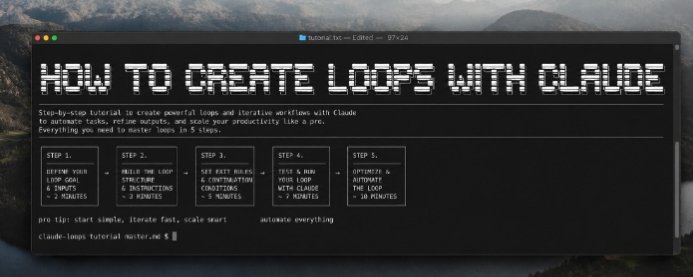
How to Create Loops with Claude
AI is great at answering questions. But the real magic happens when it can think, improve, and repeat tasks automatically.

How to Actually Set Up Claude Projects That Most Users Don't Know - Full course
Most people use Claude like a search bar.