The 5 minute slideshow format that became my best converting TikTok content
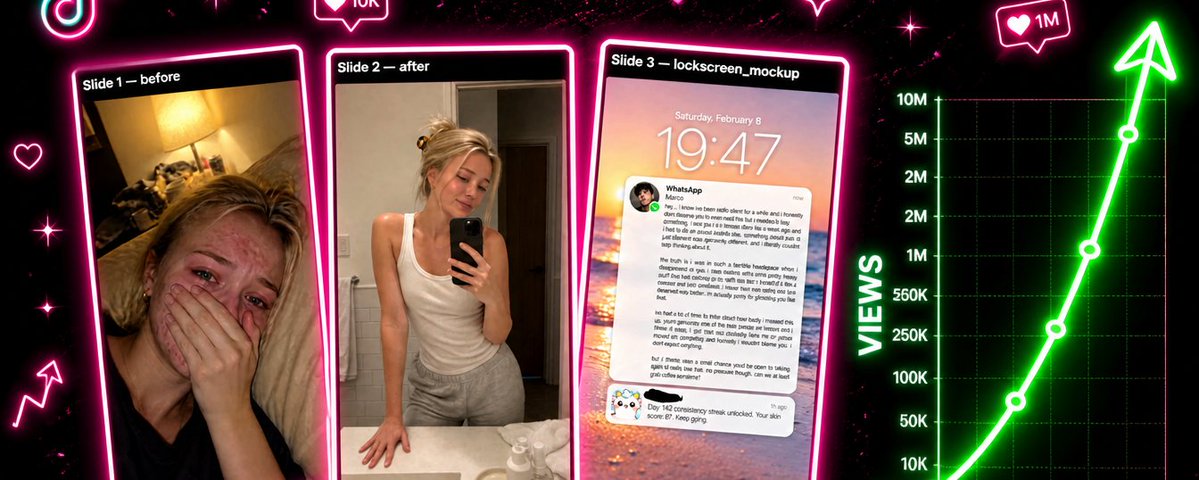
I run a TikTok content system that pumps out a specific kind of slideshow in about 5 minutes per post. It's the format that converts best on the account I run for my skincare app, and most of why it converts is something nobody talks about: the slides are so short that completion rate stays close to 100%. Everyone reaches the CTA. That's the whole game.
Here's how I generate it, the exact prompts I use, and the decisions that make the output look like a real girl's iPhone instead of obvious AI slop.
Why this format converts: completion is the only metric that matters
Long-form TikTok content has a hidden tax. The longer the post, the more viewers bail before the CTA slide. A 10 slide carousel might get great views on slide 1 and 200 people seeing slide 10. A 3 slide carousel gets the same slide 1 views and roughly the same slide 3 views, because there's no patience required to reach the end.
I built around this constraint.
→ 3 slides total, never more
→ Slide 1 = the hook (an emotional state, not a claim)
→ Slide 2 = the contrast (the same person, transformed)
→ Slide 3 = the CTA, framed as a payoff to the story
When the carousel is this short, you stop competing for attention and start competing for impact. Everyone sees the product. Everyone sees the streak. Everyone sees the notification. The funnel collapses into a single swipe.
This is the part most automation guides miss. They optimize production speed without optimizing for the constraint that actually drives conversion: how much of the post reaches the viewer. Short doesn't just mean cheap to make. Short means everyone finishes.
The format: breakup-glowup in 3 slide

The arc is a relationship breakup that becomes a glow-up. It works because the viewer projects themselves into it within the first half-second.
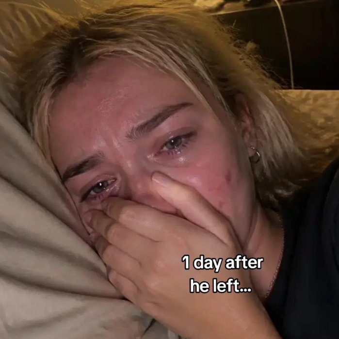
→ Slide 1: a girl crying in bed, severe acne, captioned "1 day after he left"
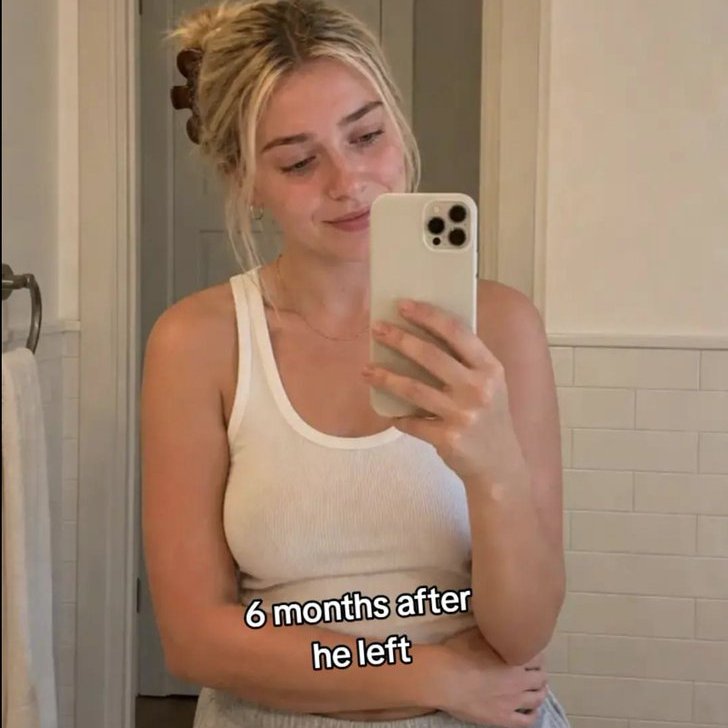
→ Slide 2: the same girl 6 months later, mirror selfie, skin completely clear, captioned "6 months after he left"
→ Slide 3: an iPhone lockscreen, a WhatsApp from the crush coming back, and a notification from my app showing a long clean skin streak, captioned "9 months later..."
The text overlays ("1 day after," "6 months after," "9 months later") are typed into TikTok's native editor at upload time, not baked into the image. Native text reads better, ranks better, and lets me A/B different captions on the same images without regenerating anything.
The viral mechanism is in the third slide: the crush messages, but never mentions skincare. He just says he sees her differently now, that he was wrong, that he wants to talk. The viewer has to connect the dots: the streak in the corner of the lockscreen is why. That ambiguity is what makes the post shareable. If the crush wrote "your skin looks amazing," the post dies. The whole emotional payoff is "what changed?" and the answer is sitting in the notification card, quietly.
The system
The pipeline is one endpoint that produces a full carousel in roughly 5 minutes:
→ Claude Haiku 4.5 generates only the content variables for the day: the girl's profile, the crush's DM, the streak number, the caption options
→ The server composes the three image prompts from fixed templates in code, interpolating the variables
→ GPT Image 2 renders the three slides, slides 1 and 3 in parallel, slide 2 chained after slide 1 because it needs slide 1 as an identity reference
The single most important architectural decision: Claude does not write the image prompts. The image prompts are fixed templates. Claude only fills in slots.
I learned this the hard way. When Claude generated the image prompts directly, the quality anchors drifted. The "lo-fi iPhone HDR" aesthetic would erode after a few generations into "cinematic" or "magazine." The asymmetric acne distribution would slowly become a uniform stamp on both cheeks. The negative list would shorten because Claude assumed I'd handle the rest.

Locking the prompts down in code fixed all of this. Claude only generates JSON. The server pastes that JSON into the prompts. The aesthetic stays across hundreds of posts.
Slide 1: the prompt that took the longest to get right
This is the prompt that does the heavy lifting. It has to produce something that looks like a real selfie from a real girl with real acne, not an AI rendering of a girl with acne. There's a big difference.
The full template, interpolated with the day's girl_profile:
A few things to notice.
The acne section is the longest part of the prompt and that's deliberate. The acne is the emotional anchor of slide 1. Viewers who have acne need to see themselves in it. If the model produces a "mild case," the slide fails. The constraint on asymmetric distribution exists because AI image models default to stamping pimples in mirror symmetric patterns on both cheeks, which immediately reads as fake. Real acne is asymmetric.
The "NO pimple on the tip of the nose" line exists because the model used to put one there in about a third of generations. Real acne almost never appears on the tip of the nose (low oil density). Including this single negative anchor killed that artifact entirely.
The single warm light source exists because GPT Image 2 will otherwise add a phone glow, an overhead bounce, and a fill from somewhere off-frame. Three light sources screams "studio." One light source from a bedside lamp screams "I just woke up at 2am."
Slide 2: identity continuity is everything
Slide 2 is the same girl, 6 months later. The catch: if you generate it independently from slide 1, it's a different girl. The model will give you a different face, different eyes, different bone structure. Continuity dies and the viewer notices immediately.
The fix is to run slide 2 as an image-edit of slide 1. Slide 1's render gets uploaded as a reference image and the prompt explicitly tells the model what to PRESERVE and what to CHANGE.
Two specific decisions worth explaining.
The left-hand pose is pulled from a pool of 10, randomly. The pool: holding chapstick, holding a white coffee mug, adjusting the claw clip, adjusting a hoop earring, hand on jawline thoughtfully, holding a hand towel, arm crossed over chest, hand resting on the counter, hand behind the ear, holding a glass of water.

The pose gets injected as a single explicit pose, not as a list of options. When you list multiple options to GPT Image 2, it defaults to the first one every time. "Touching her hair" used to show up in 90% of generations because I had it first in a list. Pick one pose per generation. Inject it directly. Vary it by random selection in code, not by giving the model a choice.
The negative list against "construction, ladder, repair, fixer-upper" exists because GPT Image 2 interprets "a real bathroom" as "a bathroom mid-renovation" about 15% of the time. The phrase that fixed it: "plain white walls" + explicit negatives against any construction imagery.
Slide 3: the lockscreen, where the conversion happens
This is the payoff slide. It's the one where the viewer connects the dots. The crush is back, the app is in the corner of the screen, and the streak is the answer to a question that was never asked.
The prompt builds an iPhone lockscreen from the LockscreenData Claude generated:
The composition rule for the cards is the part I iterated on most. Early versions put the notifications too low on the screen, pushed against the bottom edge. That left no room for the TikTok overlay text ("9 months later...") that I add at upload time. The text would land on top of the cards and ruin readability.
The fix was explicit framing rules in the prompt: notifications start immediately below the clock, occupy the middle third, and the bottom 25-30% is reserved blank wallpaper. The text now sits cleanly in the empty space at the bottom.
The DM is the entire viral mechanis
The DM that the crush sends is the hardest text generation in the system. It's 180-250 words. It's written entirely in lowercase, without apostrophes (dont, ive, im). The arc is fixed: a casual hey..., an admission of long silence, the line "I saw you differently," an apology that includes the word "ghosting," an admission of being "in a weird moment," a caveat that he doesn't expect anything back, and a closing question (can we talk?).
The single hard rule: the DM never mentions skincare, the app, or acne. He doesn't know what changed. That ambiguity is the entire viral mechanism. If he names what changed, the post becomes an ad. When he doesn't, the viewer reads the streak in the second card and provides the connection themselves.
Apostrophes get stripped because GPT Image 2 occasionally renders them as broken characters when the text is small, and because lowercase-no-apostrophe reads more authentically as a real DM than properly punctuated prose. The lowercase choice came from comparing renders side by side. Properly punctuated DMs look like AI output. Lowercase DMs look like a 22-year-old typing on his phone.
What's automated, what's manual, on purpose
The automation has hard limits, deliberately:
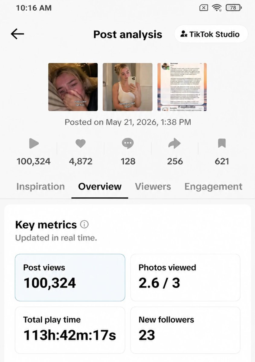
→ Generation is automated. A batch of 5 carousels takes about 5 minutes, all 15 images rendering in parallel.
→ The captions are automated. Claude generates 3 options per post and picks one.
→ Hashtags are pulled from a curated pool that excludes known anti-floppers, tags that correlate with sub-50 view posts. I keep that list updated by hand based on what underperforms.
→ Publishing is manual (draft). I review each carousel before it goes out. I add the TikTok overlay text manually because typing "9 months later..." natively gets better algorithm treatment than baking it into the image, and because I want to A/B that text without regenerating the slide.
The manual steps cost about 2 minutes per post. The automated steps cost about 1 minute of attention (clicking generate, waiting, picking the best of the batch). Total: 3 minutes of human time per published post.
You can do this by hand too
Before going further: you don't need to automate any of this to start.
If you only ship one or two of these a day, paste the prompts above into GPT Image directly. Write the DM yourself. Use any photo editor for the lockscreen mockup. The format works regardless of how the images get made. The system I built is just what makes it possible to ship five carousels in five minutes instead of one in two hours.
The decision to automate is a volume decision, not a quality one. Manual generation produces slightly better images because you can re-roll until each slide is exactly right. Automated generation produces good-enough images at scale and lets you A/B faster. Both work.
If you want to build a system around it, I wrote a separate article on how I turned this kind of cloning workflow into a full pipeline, scraping references, storing what works, proposing new posts from a library. That piece covers the infrastructure. This one covers the format.
The short version of the build
For anyone wanting to replicate the automation here specifically:
→ A model that generates content variables (Claude Haiku, GPT-4o-mini, whatever you have)
→ Higgsfield with GPT Image 2 for rendering, Nano Banana Pro is also fine → Three image prompt templates in code, not in the model prompt, locked down so the aesthetic anchors never drift
→ A pool of girl variations injected as hard constraints, so every post doesn't look like the same person
→ A parallel bulk endpoint so a batch of 5 carousels takes 5 minutes instead of 25
The order matters. Get one slide right end-to-end before you build the second. Get all three slides right at single batch scale before adding bulk parallelization. Skip steps and you'll be debugging three things at once instead of one.
What this changed for me
The 3 slide format outperforms every other format I've tested on this account, and most of why is the completion rate. Every viewer that swipes past slide 1 sees the CTA. The lockscreen slide does the conversion work because it's the last thing on screen, with the app's notification visible, when the viewer is at the emotional peak of the story.
Production time dropped from "an afternoon per post" to "5 minutes per batch." But the bigger shift was that I stopped thinking about content as something I write and started thinking about it as a format I configure. The hook is fixed. The arc is fixed. The aesthetic is fixed. The only thing that changes day to day is which girl, which DM, which streak. The format does the heavy lifting and the variation keeps it fresh.
The carousel makes thousands of views per post on the small account I'm scaling, and across a batch of 5 it adds up fast. The conversion to app installs is the highest of anything I've shipped, because the CTA isn't an interruption. it's the punchline of the story.
Short content. Fixed structure. Locked prompts. Everything else handled in code.
That's the whole system. Embedded post:
Author: Adrià Martinez (@adriamatz) Post ID: 2057074664145322161 Source: https://x.com/adriamatz/status/2057074664145322161 Reply to: none
Text:
> http://x.com/i/article/2057067803249688576
Prompts
PRESERVE FROM IMAGE 1 (identity continuity is critical):
- Exact facial structure
- Hair color: {hair_description}
- Eye color: {eye_color}
- Skin tone: {skin_tone}
- Eyebrow shape, nose, lips, jawline
- Thin gold chain necklace + single hoop earring (the only accessories
  that carry across slides)

CHANGE:
- Half-body mirror selfie. iPhone held in right hand at chest level.
- Left hand: {random_pose_from_pool}
- Skin: completely clear, healed, dewy. No acne, no pimples, no PIH marks.
- Hair pulled back in a tortoise/amber claw clip with two face-framing
  pieces loose.
- Outfit: white ribbed tank top + light grey sweatpants.
- Expression: natural relaxed smile, calm eyes. NO performance smile,
  NO influencer smile.
- Lighting: ONE warm vanity bulb above the mirror.
- Background: a NORMAL bathroom. Plain white walls.

NEGATIVES: construction, ladder, repair, fixer-upper, drop of serum
on cheek, ring light, professional photography, model pose.
An iPhone lockscreen mockup, 9:16 vertical.
WALLPAPER: A sunset over the ocean, blurred bokeh, transitioning from
pink-orange-lavender at the horizon to deep blue at the top.
NO status bar at the top (no carrier, no signal, no wifi, no battery,
no time bar).
CLOCK: Centered in the top 20% of the frame. iOS San Francisco thin font.
- Small date above: {clock_date}
- Large time below: {clock_time}
NOTIFICATIONS: Two notification cards, starting IMMEDIATELY below the
clock (small gap, ~5% frame height), occupying the middle third of the
frame. The bottom 25-30% of the frame must remain empty wallpaper for
overlay text added later.
CARD 1 — WHATSAPP:
- Circular avatar of the crush on the left. Description:
{crush_profile_photo_description}
- Green WhatsApp icon overlapping the bottom-right of the avatar.
- Header row: "WhatsApp" bold, "{crush_name}" lighter, "now" small grey
on the right.
- Body, verbatim: "{crush_dm_text}"
CARD 2 — APP NAME:
- App icon from the reference image attached.
- Header row: "App Name" bold, "1h ago" lighter on the right.
- Body, verbatim: "{appname_notification_body}"A first-person POV iPhone front-camera selfie of a {age_range} year old
{vibe} girl with {hair_description}, {eye_color} eyes, and {skin_tone} skin.
She is lying on her side on a cream-beige pillow in her bed. Her hand
covers her nose and the lower half of her mouth — knuckles bent, fingers
slightly apart, NOT a closed fist. Both eyes are visible and clearly
red, swollen, and puffy from crying. Real tears running down both cheeks.
SKIN: Moderate-to-severe inflammatory acne, ASYMMETRIC — one side worse
than the other.
- Forehead: 6-10 active pimples (papules + pustules + 1-2 cystic)
- Visible cheek: 4-6 active pimples
- Temple: 2-4 pimples
- Jawline/chin: 2-4 deeper hormonal pimples
- 10-20 PIH (post-inflammatory hyperpigmentation) marks scattered
- NO pimple on the tip of the nose (unrealistic)
LIGHTING: ONE warm yellow-white bedside lamp visible at the top of the
frame. NO phone glow, NO multiple light sources, NO ring light,
NO overhead lighting.
BACKGROUND: A real, messy bedroom. Clothes piled on a chair.
Nightstand with trash and a half-empty drink can. Off-white walls,
slightly grimy. NO studio, NO photoshoot setup.
QUALITY: Real iPhone HDR night photo with light grain. NO 480p,
NO cinematic, NO magazine quality.
NEGATIVES: cool blue lighting, beauty filter, perfectly symmetric face,
doll eyes, TikTok UI elements, status bar, hands holding a phone,
mirror selfie, professional lighting setup, model-like features.Related articles

How to Turn One TikTok Video Into a Global Income Stream
You spend hours researching an AI tool, writing a script, recording the video, and editing it into something genuinely useful.

I Brutally Modified My Front-End Design Skill ~ Now My UIs Don’t Look Like AI Crap
To create a custom Claude skill, navigate to Customize > Skills in your Claude interface, click the + button, and select + Create skill
claude for research, grok for funnels = $22k/m info beast
everyone using AI wrong, treating all models like they're interchangeable, asking chatgpt to do everything from research to copywriting to funnel building to customer service, getting mediocre output…